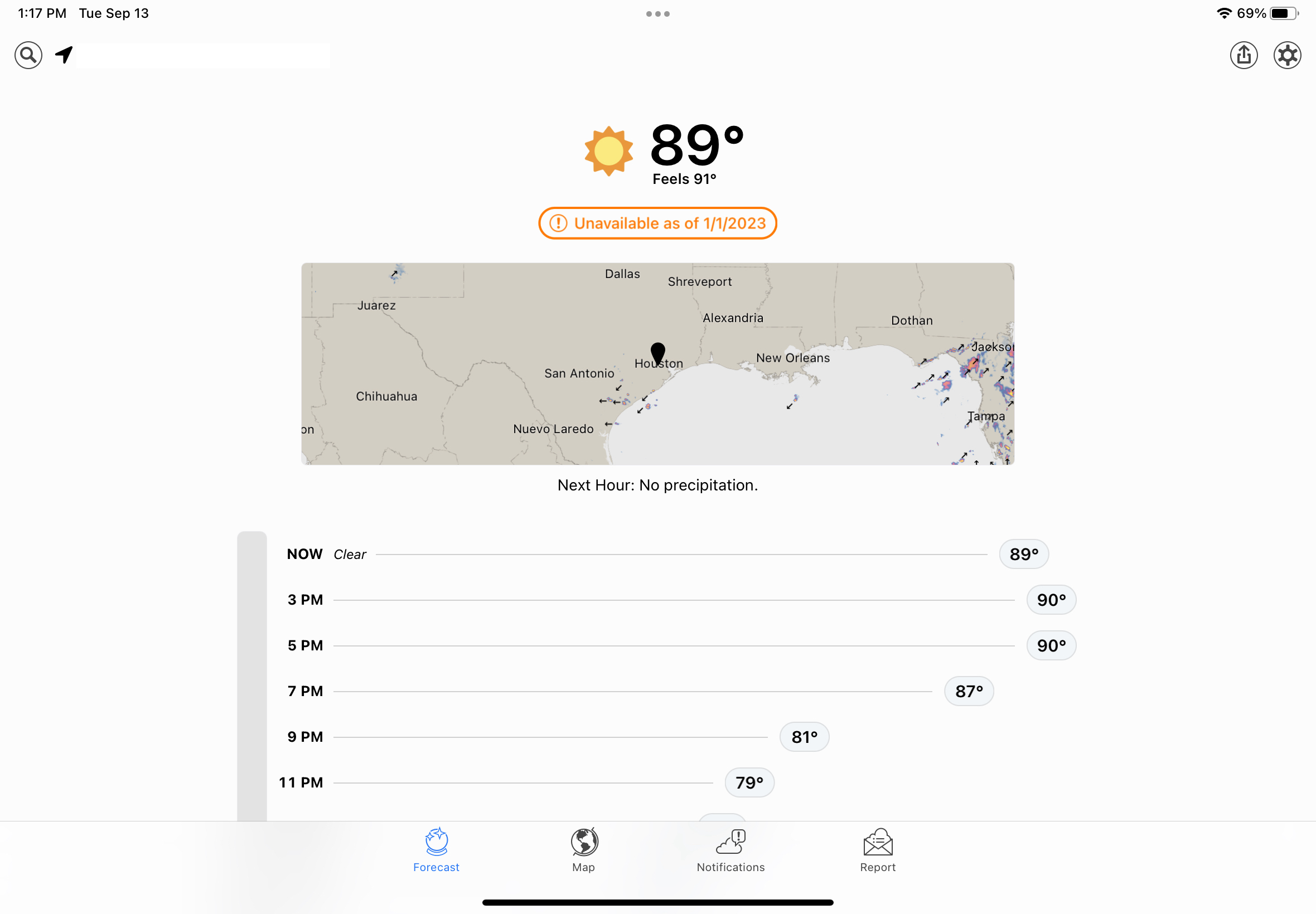
Alas, poor Dark Sky! I knew it well.

If you’re an iPhone user who downloaded and installed iOS 16 after its release on Monday, take some time from learning to configure those nifty customizable lock screens and tap on the included Weather app. On the surface, it looks a lot like the updated version introduced in iOS 15 – but below the surface is where the action is.

Tap any one of the cards on the main display – hourly or 10 day forecasts, humidity, air quality, UV index, wind, precipitaton and more – and you’ll get a screen with lots more information. Suddenly, the iOS Weather app is one of the best out there for climate data junkies.

But in order for iOS Weather to get this new life, something had to die. That’s Dark Sky, the hyperlocal weather app that Apple purchased in 2020. It will be shut down on Jan. 1, 2023.

The Dark Sky Company launched the app on iOS in 2012, then added an Android app. When Apple acquired Dark Sky, the Android version was killed shortly thereafter, and paid users of that platform were given full refunds. There is no indication recent buyers of the $3.99 iOS app will get their money back.

At least one user, who replied to a Tweet about Dark Sky’s impending demise, expressed annoyance because she had paid for it twice, including a few months ago.

Dark Sky also built an API for its weather data, and charged other developers to tap into it. That API is also going away, along with the excellent Dark Sky website, shutting down on March 31, 2023. The API is being replaced by WeatherKit, an Apple weather service which will cost less than Dark Sky’s did, and offer developers 500,000 API calls per month before charging.

While the iOS Weather app is beautiful, and the depth of data very impressive, I’ll still miss Dark Sky app and the web page. The app’s interface was nowhere near as gorgeous as Apple’s, but it was simpler and I think clearer in some instances.

It’s hard to believe that Dark Sky has been around for a decade. I first discovered it in late 2013, when a friend using it told me it was about to rain, and a few minutes later the sky opened up in a downpour. I happily forked over my $3.99 and have been a fan ever since.

One of the features that Apple has finally brought over from the original app is the one that originally sold me: weather alerts for your current location. I’m hoping over time I’ll come to love the iOS Weather app as much as I do the original Dark Sky. A few predicted downpours oughta do it.

Building a freelance infrastructure with Authory & Spark [Updated]

(Last updated 3:17 pm CDT October 14th, 2022)

Even though I’m kinda retired, I’m still doing some freelance writing. That’s what my resurrected Houston Chronicle column is, and I’ll also be writing occasional, standalone pieces for the paper. Since most of my writing has been for publications, I never spent much time building up an infrastructure for freelancing. Now, I’m fixing that, and I’ve come across a couple of products that help with that.

🎵 All of me, why not take all of me? 🎶

The first is Authory, a paid service that generates a portfolio by pulling your content from all the places it lives on the web and organizing it in an attractive, useful archive. You can then provide a publication you’re pitching a comprehensive look at your body of work.

While I’ve spent most of my full-time-employee status at the Chronicle, the paper’s online presence has multiple URLs. My stuff is the subscription-based HoustonChronicle.com, of course, but some of it also found at the free Chron.com. The latter has many of my older columns and tech stories, published before the paid site was launched. And there’s also my old TechBlog, which has its own unique URL. On top of that, I’ve written at Forbes, a little bit at Medium, and of course here on The Workaround.

Authory lets you enter the URLs where you byline is found and, within 48 hours, creates a profile page with a smartly designed, responsive look. Readers can see the list based on a text search, dates or publication.

There are other features that I have yet to dig into, including the ability to write on the Authory site; tracking your content’s social media performance; limiting who can see what items; build collections based on keywords or manual curation; and generate RSS feeds. People can also subscribe to a mailing list that alerts them when you have a new item in your profile.

There are no ads on the site, and all your content is available to anyone (unless you restrict it in some way), but it won’t get people past a site’s paywall. That said, when an Authory user clicks on an item on their own profile page, it comes up in a clean, ad-free reader view – which is part of a content backup Authory creates for you.

There’s a two-week free trial, which can be extended to four weeks if you tweet about Authory on Twitter. After that, it’s $10 a month or $8 a month if you pay for a year in advance. (If you review it, you’ll get a free year. I am not writing this for that purpose, and won’t accept a free year. It’s worth paying for!)


Spark is everywhere: iOS, Android, macOS … and soon, Windows.

When I was at the Chronicle as a staffer and at Forbes, I used Outlook for work email both on my Windows desktop at the office and my Macs at home and on the road. When I was no longer an employee, I lost access to the Outlook and was at the mercy of the Mail app on macOS. I’ve never cared for it, and relying on it day-to-day didn’t change my feelings.

An issue with a recurring password popup drove me to seek an alternative, and I found an excellent one in Spark, a free email app from Readdle, which makes productivity software. I’d tried Spark when it first launched and wasn’t that impressed, but it has greatly improved since.

Spark falls into the simple-but-powerful category. It’s fast, intuitive and can handle almost any email format, including Microsoft Exchange (which I don’t need at the moment, but it’s good to know it’s there). Besides Exchange, it also supports Gmail, Outlook.com, Office 365, iCloud, Yahoo, Kerio and IMAP email servers.

The app is available for macOS, iOS and Android, and a Windows version is in the works. Its cross-platform nature is an added bonus because it’s remarkably easy to set up the software on a new device, particularly if you have a boatload of inboxes, as I do. Once you have all your accounts established in Spark on one device, all you need to do after installing the app on another is to log in to your primary account, and all the others are automagically added. Sweet!

As do most modern email clients, Spark uses AI to emphasize important emails over those that are less critical. But if you want to see your inbox in pure chronological order, you can turn that off (which I do). Unfortunately, the default workflow is a unified inbox, and while you can’t turn it off completely, you can display all your inboxes in the the left sidebar of the app. With nine email accounts, I’d rather they not all be merged into one.

Spark’s layout looks a lot like Outlook and the Mac’s Mail app, but leaner. The left sidebar has your mal accounts and folders; the middle are the headers and summaries of your mail; and the right pane is a full-sized reader.

As do a lot of email clients, you can create templates for canned responses, schedule email and “snooze” emails you want to get back to later. You can also set reminders to reply to mail that you can’t get to right away. And if a communique doesn’t really require a full response, there are social-media-like responses and emojis you can employ.

Spark integrates with calendars and a slew of online services, including Zoom, Microsoft OneNote, Evernote, Trello, GoToMeeting and more.

Spark also has some collaboration features and the ability to create Teams to work jointly with email, but the number of participants is limited on the free version. You get more capabilities and more shared users for $7.99 a month or $6.99 a month billed yearly. But for most individual users, the free version is an excellent alternative to Outlook or the Mail app.

Update 11.29.21: In a conversation on Twitter this morning, the offical @SparkMailApp account let me know that the Windows version will actually be “a brand new desktop app” for both Windows and Mac.