Review: CarpodGo’s T4 Plus is CarPlay that’s bright, fast and in your face.

Note: In June, the personal technology column I’d written for more than 30 years at the Chronicle ended. After spending the summer enjoying being a bum, studying the art of retirement and mostly watching paint dry, I’ve decided to write occasionally here when the mood strikes, or when I come across some gear I think you’ll want to know about. That’s what this is: CarpodGo approached me about reviewing their latest CarPlay display, and as you will see, I had a personal reason for checking it out. Expect to see more of this in the coming months. -D.S.


Almost a decade ago, my lovely wife bought a new car: A 2017 Prius 4. I’d gotten a look at this redesigned version of Toyota’s original hybrid the year before, when I reviewed the 2016 version for my blog. My wife had a 2012 Prius and loved it, and shortly after my review she gave that vehicle to our oldest.

While the 2017 Prius was a comfortable car with killer gas mileage – I had been able to get 85 mpg under the best conditions – it lacked one important feature. Toyota had not yet adopted Apple’s CarPlay, which mirrors an iPhone user’s phone screen in a vehicle’s infotainment system. I enjoyed driving her car until, two years later, I bought a 2019 Toyota C-HR, which did have CarPlay. Suddenly, I was spoiled, and I would always prefer to drive my car, despite the Prius’ more economical oeuvre. I became a CarPlay snob.

And it’s not just me. iPhone users who own vehicles with CarPlay usually become die-hards. Just ask GM, who suffered the slings and arrows of internet scorn when the company announced it would support neither CarPlay nor Android Auto in its latest electric vehicles – and then doubled down by saying that it would eventually drop the features in its gasoline-powered fleet as well.

GM’s stance pretty much guaranteed I’d never buy a GM EV; many other CarPlay fans feel the same way. (It’s worth noting that while Android Auto is also digitalia non grata on GM cars and trucks, Google is supplying a custom version of Android as part of its software package.)

The point to be made is this: Once you’ve had a phone-mirroring technology like CarPlay or Android Auto on your dash, it’s very hard to go back. But if you have an older car or truck that doesn’t support CarPlay, you’ve got two options: Either replace the head unit for the stereo/infotainment system with one that allows for phone mirroring, or add a standalone display dedicated to mirroring an iPhone or Android device.

The joy of the display

The latter category is simpler and less expensive, and there are literally dozens of models available on Amazon. However, their quality varies, and many suffer from the same problems as the cheap adapters that provide wireless CarPlay/Android Auto capabilities to vehicles that only have the wired variant. The issues include connection drops and sluggish performance. In addition, the cheaper standalone displays are sometimes slow and not bright enough in direct sunlight.

So, when vehicle-screen maker CarpodGo offered a review unit of its latest high-end CarPlay screen, I was intrigued. I’d long thought about trying a standalone display for CarPlay in my wife’s Prius, and here was an opportunity to see what she’d think. Even though I was trying really, really hard to be retired, I told the Chinese-based company to bring it on.
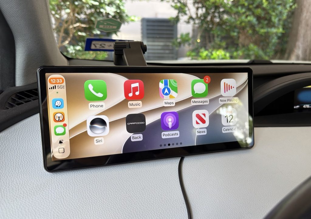
CarpodGo’s T4 Plus features a 10.9-inch diagonal display with a brightness rating of 1,000 nits. (Dwight Silverman photo)

CarpodGo shipped me the T4 Plus, its flagship device that just became available on Amazon, where it currently sells for a list price of $250. The T4 Plus is a beast, with an expansive 10.9-inch diagonal IPS display that boasts a brightness rating of a whopping 1,000 nits and a refresh rate of 60 Hz. It includes several different dashboard mounts, a custom DC-port plug to power the screen and an actual physical manual – a rarity these days, when online documentation is more often the standard – though it’s printed in the tiniest font imaginable. A magnetic base connects to the various mounts that lets you quickly remove the display if you don’t want to leave it in your car when when away.

A smaller version, the T4, is functionally identical but with an 8.9-inch diagonal display. It lists for $230.

CarpodGo also sells an optional rear-view camera for older vehicles that lack one, which is now required as a safety feature. It works with both sizes.

My original approach was to set this up in the 2017 Prius and let my wife use it for a while as part of the review. But just before the T4 Plus arrived, our kid’s hand-me-down 2012 Prius incurred yet another major repair. As reliable a vehicle as it’s been, after 14 years its time had come – it was costing us more than it was worth. We made the call to give them the newer Prius, which meant I needed to drive the car nearly 800 miles from Houston to where they live in southwestern Illinois. My wife already had a plane ticket for a planned visit, so I was on my own on the road – just me and the T4 Plus for two full days of summer driving.

Set up and go

Getting the display ready to go was fairly easy. As is the case with wireless CarPlay adapters, CarpodGo’s screens connect to a phone first via Bluetooth, then hand off to a WiFi connection. Since the screens don’t come with speakers, you must also make sure you have a Bluetooth connection to your infotainment system – which, if you’ve been toodling around in a vehicle without CarPlay, you likely already have – for audio and phone calls.

Oh, and here’s a setup tip: You don’t actually have to be in the car to initially pair your phone to the screen. You can do it in the comfort of your home, with the screen connected via USB-C to any charger that supports the Power Delivery charging protocol and can provide at least 9 volts of power. Once paired, you can focus in the vehicle on getting the display mounted on the dash.

And getting it mounted is the bigger challenge. Both the T4 Plus, which weighs just over a pound with the magnetic base attached, and the smaller T4, require that the bottom of the screen be resting on the top of the dash. That’s because with any of the supplied mounts, the vehicle’s movement can cause the whole assembly to come loose while driving if the display is suspended. As a result, finding a location in the vehicle where the screen is in easy reach for touching but also adequately supported was tricky in the Prius. I wound up placing it to the left of the steering wheel.

Also keep in mind that, even though this is wireless CarPlay, it’s not really “wireless.” In fact, you’ll need two cables – one to feed power to the display, and another to keep your phone charged while using GPS and navigating. For that reason, I opted not to use the included power cable and plug that came with the T4 Plus, because while it has a USB outlet for a phone on the plug, it’s USB-A, which doesn’t provide enough muscle to keep my iPhone 17 Pro Max charged while Waze or Apple Maps keep track of where I am. Instead, I used a 120-watt adapter that plugs into the DC port with 2 USB-C connections.

On the road with the T4 Plus

During the two-day drive, using the T4 Plus for CarPlay was a joy. Its wide display presents an additional column of app icons than found my C-HR’s smaller screen. It’s also much faster then my car’s built-in display – swiping between screens and opening apps was lightning-quick. And the super-bright screen was perfect for the sunny, cloudless conditions of a long summer road trip. (It auto-dims as needed.) The connection was rock-steady, and connected to my phone instantly whenever I started the car.
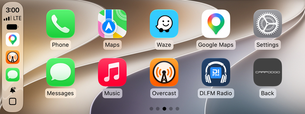
Screenshot of the T4 Plus display, showing two rows and generous five columns of apps.

But those sunny conditions resulted in one of the few glitches in my testing. Temperatures all along the route were close to or sometimes over 100 degrees, and because the T4 Plus was atop the dashboard and thus was often in direct sunlight. The resultingheat would cause the display to slow down so that apps dragged while opening, and moving between home screens was sluggish. The fact that the back of the screen is black plastic didn’t help, and for much of the drive was hot to the touch. When it was not in direct sunlight, or after I’d stopped for a while and then got back on the road, performance returned to normal.

This is not uncommon among smart devices. Anyone with an iPhone who has it mounted in a vehicle so that direct sunlight hits it has experienced the “Charging on hold until iPhone returns to a normal temperature” message. In this case, the T4 Plus was usable, just a little annoying.

One other annoyance had nothing to do with the screen itself, but rather the Bluetooth connection in the Prius. Because the vehicle dates back to 2014, it uses an older version of Bluetooth, and the audio during phone calls was, um, sub-optimal, with low-quality sound that was sometimes difficult to hear. This was something my wife often complained about while she was driving the car, and on my trip I felt her pain. The T4 screens do have have the option to use a direct AUX jack connection or even an FM connection to the radio for audio. I didn’t try either.

One feature I wish the T4 Plus had: A dashcam. Given that the screen must sit atop the dashboard, it has a great view of the road ahead. I would have preferred that over the rear camera option, though adding a recording camera to the display could have made the heat issue worse.

One other missing feature: Over-the-air firmware updates. The T4 Plus and T4 require that you download new firmware to a flash drive, which is then inserted into a USB-C port on the back of the screen. This is cumbersome and could result in errors. A CarpodGo spokesperson said the company is working on adding OTA updates, but didn’t have a timeline for when.

Conclusions

The CarpodGo T4 Plus is an excellent standalone CarPlay display, and if you’re in the market for a way to bring CarPlay to an older vehicle, it’s worth your consideration. However, I have one caveat. In a smaller car like the Prius, or any vehicle with limited space to mount the display, I’d recommend the smaller, 8.9-inch model, which has the same brightness and speed.

Is your car’s cabin even more cramped? The company also makes the Mini, a 6.9-inch version with the same 60-Hz refresh and 1,000 nits of brightness. It lists for $120, and is easily the best value of the three. Another benefit: The Mini does not require that the bottom of the screen be resting on the dash. Bueno.
How I set up a new Mac [Updated x3]

(Last updated 3:07 pm CST February 19th, 2026)

[Updated this post on 2/5/2026 to reflect changes in the process, and additional apps I install.]

Because I regularly review Apple’s Mac laptops and desktops, I’ve developed a setup routine for to make them my own for the brief period I have them. It’s similar to what I do when I get a new Mac for myself, though that takes place over a period of days and includes copying over data that I don’t have stored in iCloud and apps that are mostly for the researching and writing I do for my column.

Yeah, I know, I could use Migration Assistant or other tools to automate this, but I like the idea of a fresh start, and being able to ponder, then pick and choose what I want to keep or discard.

Of course, there are steps I’ll forget, so I wanted to write the process down. This is as much for my convenience and forgetfulness as it is for your geeky voyeurism. Anyway, here’s how it goes:

  • In the initial setup process, I typically just keep the default selections. If I want to change something, I can always do it later.
  • Go to Settings > Trackpad, turn on Tap to click
  • Open Finder, drag Applications, Utilities, Documents folder to the right side of the Dock
  • Settings > Display, set to More Space on a laptop, Default on a desktop
  • Finder > Settings, add Hard Disks and Connected servers to the desktop, remove CDs, DVD, iPods
    In Sidebar, add user folder
    In Advanced, performing a search to Current Folder
    In Finder > View in the Menu bar, turn on Path Bar, Status Bar, Tab Bar
  • In the Dock remove Keynote, Numbers
  • Open Safari, download and configure Microsoft Edge, set as Keep in Dock (Sorry, Mac purists, but I fell in love with Edge when I saw its vertical tabs implementation, and I’ve never looked back.)
  • Settings > Desktop and Dock, enable magnification, set Edge as default browser
  • Download, install and configure iStat Menus
  • Download, install and configure Apparency
  • Download, install and configure Ice (a beta Menu Bar manager)
  • Download, install and configure AirBuddy
  • Download and install Geekbench
  • Download, install and configure Parcel, a shipment tracker
  • Download and install Mactracker
  • Download, install and configure ChatGPT
  • ADDED: Download, install and configure Bauhaus Clock.
  • ADDED: Download, install and configure Better Display.
  • ADDED: Download, install and configure Coconut Battery.
  • ADDED: Download and install Folder Quick Look.
  • ADDED: Download and install MacWhisper.
  • ADDED: Download and install Descript.
  • ADDED: Download and install Our Groceries.
  • ADDED: Download and install Overcast.
  • ADDED: Download and install RadarScope.
  • ADDED: Download and install the Space City Weather app.
  • Download and install Parallels for Mac and Parallels Toolbox, enabling Toolbox’s Free Memory and Clipboard Manager to appear in the Menu Bar. Set up a Windows 11 VM in Parallels.
  • Download, install and configure Spark Desktop, set as Keep in Dock. (After a disastrous version 3.0 release, Spark has redeemed itself with its latest, 3.5 update. Just don’t expect too much from its ChatGPT integration.)
  • I recently subscribed to Microsoft 365, installed via the web. I am using Outlook as my primary email client, but continue to use Spark to see how its development is going.
  • Download, install and configure the Mona 7 for Mastodon client
  • Open Messages, turn on Messages in iCloud
  • On iPhone Settings > Messages > Text Message Forwarding, enable messages from the new Mac
  • Enable iPhone Mirroring with my current iPhone.
  • Set Weather, Text Edit to Keep in Dock
  • In Settings > Control Center, let Weather to post current conditions in the Menu Bar.
  • Set macOS Passwords app to show its icon in the Menu Bar
  • In Automator, create “Get to work” application to launch Spark Outlook, Edge, Mona and Messages, put alias on the desktop
  • In Automator, create “Quit all apps” application, put alias on the desktop

That’s it for now. I’ll tweak this over time.

Alas, poor Dark Sky! I knew it well.

(Last updated 3:17 pm CST February 19th, 2026)

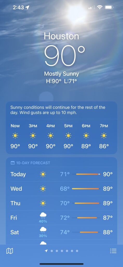
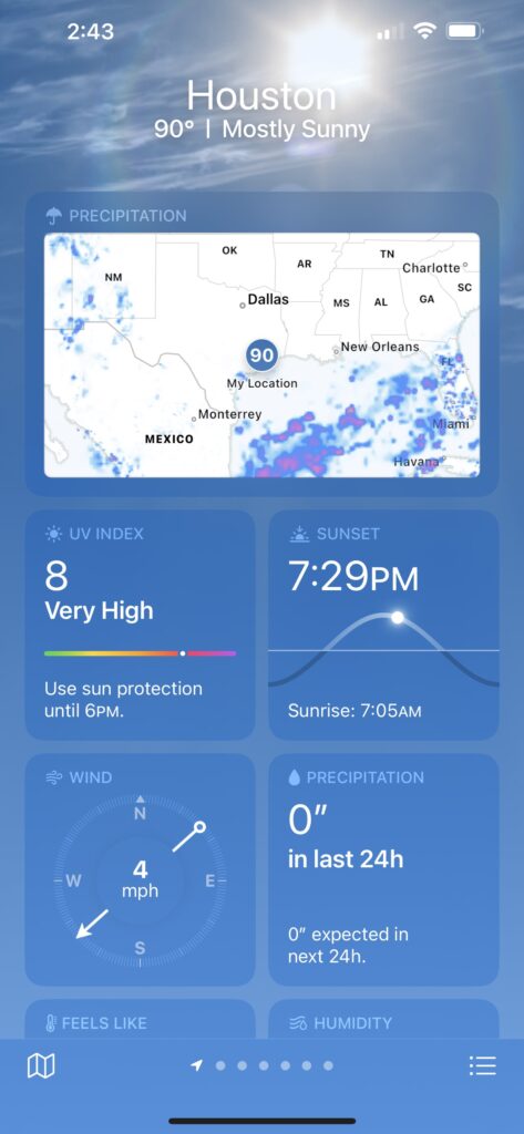
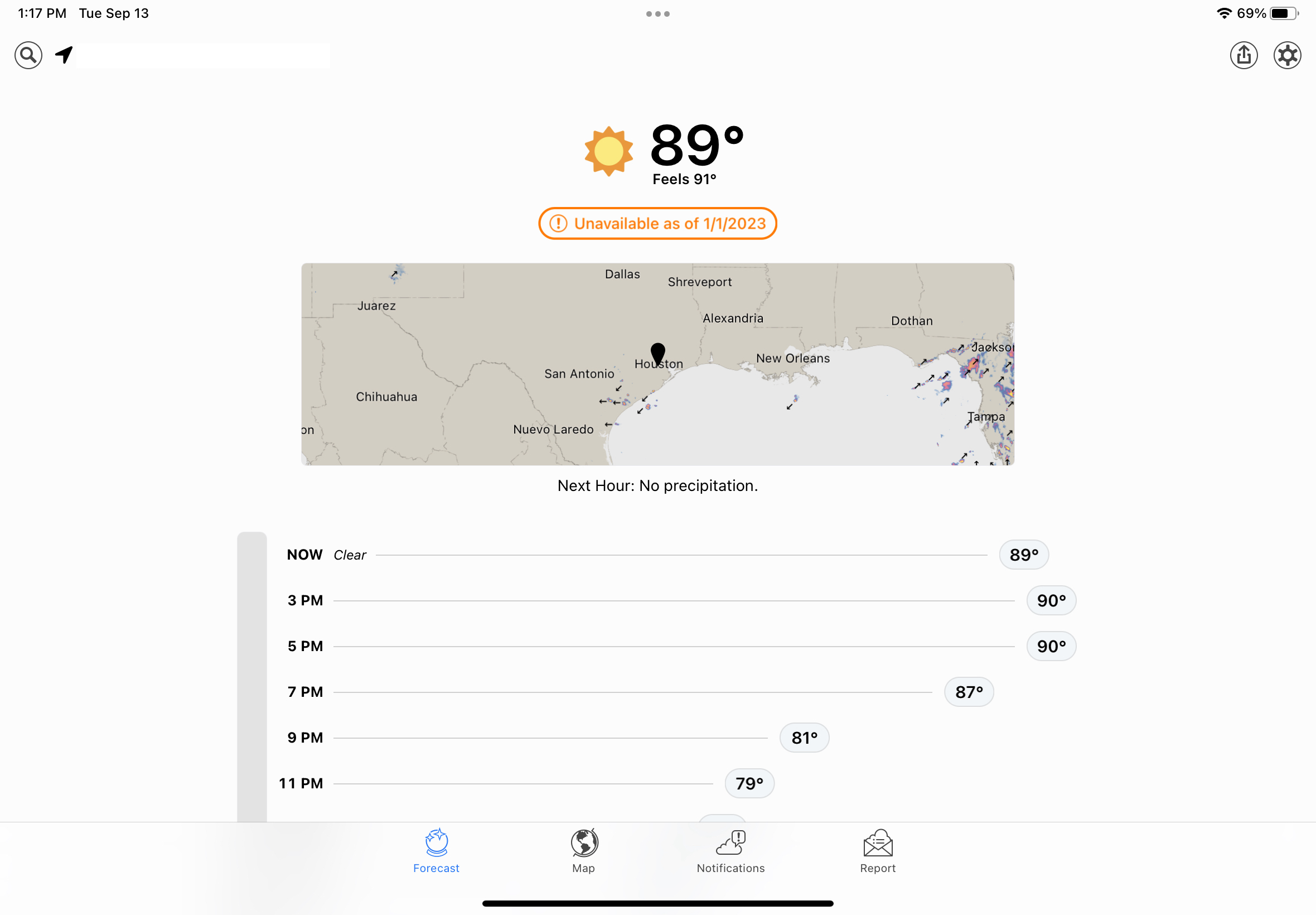
If you’re an iPhone user who downloaded and installed iOS 16 after its release on Monday, take some time from learning to configure those nifty customizable lock screens and tap on the included Weather app. On the surface, it looks a lot like the updated version introduced in iOS 15 – but below the surface is where the action is.

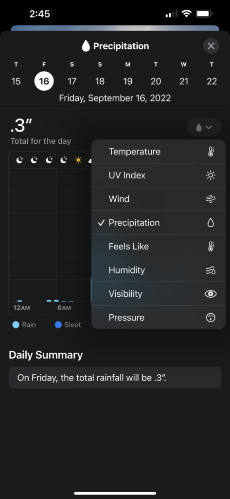
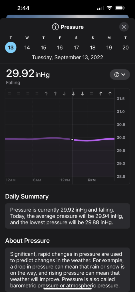
Tap any one of the cards on the main display – hourly or 10 day forecasts, humidity, air quality, UV index, wind, precipitaton and more – and you’ll get a screen with lots more information. Suddenly, the iOS Weather app is one of the best out there for climate data junkies.

But in order for iOS Weather to get this new life, something had to die. That’s Dark Sky, the hyperlocal weather app that Apple purchased in 2020. It will be shut down on Jan. 1, 2023.

The Dark Sky Company launched the app on iOS in 2012, then added an Android app. When Apple acquired Dark Sky, the Android version was killed shortly thereafter, and paid users of that platform were given full refunds. There is no indication recent buyers of the $3.99 iOS app will get their money back.

At least one user, who replied to a Tweet about Dark Sky’s impending demise, expressed annoyance because she had paid for it twice, including a few months ago.

Dark Sky also built an API for its weather data, and charged other developers to tap into it. That API is also going away, along with the excellent Dark Sky website, shutting down on March 31, 2023. The API is being replaced by WeatherKit, an Apple weather service which will cost less than Dark Sky’s did, and offer developers 500,000 API calls per month before charging.

While the iOS Weather app is beautiful, and the depth of data very impressive, I’ll still miss Dark Sky app and the web page. The app’s interface was nowhere near as gorgeous as Apple’s, but it was simpler and I think clearer in some instances.

It’s hard to believe that Dark Sky has been around for a decade. I first discovered it in late 2013, when a friend using it told me it was about to rain, and a few minutes later the sky opened up in a downpour. I happily forked over my $3.99 and have been a fan ever since.

One of the features that Apple has finally brought over from the original app is the one that originally sold me: weather alerts for your current location. I’m hoping over time I’ll come to love the iOS Weather app as much as I do the original Dark Sky. A few predicted downpours oughta do it.

The next big-screen iMac may be a Pro. As a 27-inch iMac owner, I’m fine with that.

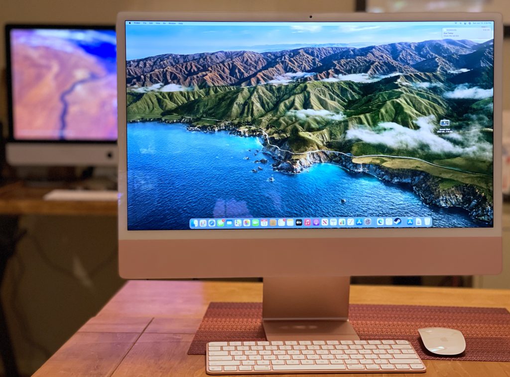
Apple’s 24-inch, M1-based iMac, with my beloved 27-inch, 2020 model in the background. Still no buyer’s remorse. (Dwight Silverman photo)

When my 2012 Mac mini fell off the compatibility list for Apple’s latest macOS update in 2020, I was confronted with a choice. I typically replace my Macs when they won’t get new updates, so it became time to say goodbye to this desktop workhorse. But at the same time, Apple announced at its Worldwide Developers Conference that year that the company would be moving to Macs built around its own processors, dubbed Apple Silicon.

While Intel-based Macs would continue to be sold, they were clearly the past, and Apple’s own chips were its future. The transition would take two years, and there was no guarantee which models would appear when. Still, I needed to make a decision now.

I wound up buying a 27-inch Intel iMac. Despite its transition away from Intel, Apple introduced an upgraded version of this design, which had been around forever. As I wrote in a review shortly after my purchase, it’s an incredibly powerful machine. I was happy . . . and still am.

But.

The introduction of the lower-end, smaller, 24-inch iMac with Apple’s own M1 processor last year showed the potential of this new platform. And it made me think . . . will I have buyer’s remorse once a larger-screen version of this iMac inevitably appears?

With the publishing today of Bloomberg Apple-beat reporter Mark Gurman’s latest Power On newsletter, I know the answer: No.

At least, not for a while.

Gurman, who’s got a good track record when it comes to Apple intelligence, lays out the company’s roadmap for updated Macs:

  • A new Mac mini with an M1 Pro chip
  • A 13-inch MacBook Pro with an M2 chip, to succeed the 2020 model and sit below the 14-inch and 16-inch MacBook Pro in the line
  • A Mac mini with an M2 chip
  • A 24-inch iMac with an M2 chip
  • A redesigned MacBook Air with an M2 chip
  • A larger iMac Pro with M1 Pro and M1 Max chip options [my emphasis]
  • A half-sized Mac Pro, the first with Apple Silicon, with the equivalent of either two or four M1 Max chips

If he’s correct – and with leaks, that’s always a big IF – then the next iMac with a larger screen is likely to be branded as an iMac Pro. The previous iMac Pro, which was discontinued last year, was incredibly powerful and incredibly expensive. In the subscriber-only version of his newsletter, Gurman also predicts that a lower-end, big-screen iMac is likely not coming soon.

That means the 27-inch iMac I purchased in 2020 is going to end as an even better buy. And I say that relatively, because this computer is not cheap. It starts at $1,800; the model I purchased was $2,400, not including Apple Care and taxes. I bet slapping the “Pro” label on the next version will add at least $1,000 to the price.

I would not be surprised if Apple continues to sell the 2020 27-inch iMac even after the release of a new iMac Pro, as it continued to sell the last Intel version of the MacBook Pro after the release of its first M1 laptops. The Intel model wasn’t laid to rest until the M1 Pro and Max versions were available.

Of course, all this remains speculative. It’s only rumor and vapor until it’s real. But for now, I remain comfortable with the choice I made.

Confessions of a MacBook Pro Touch Bar fan

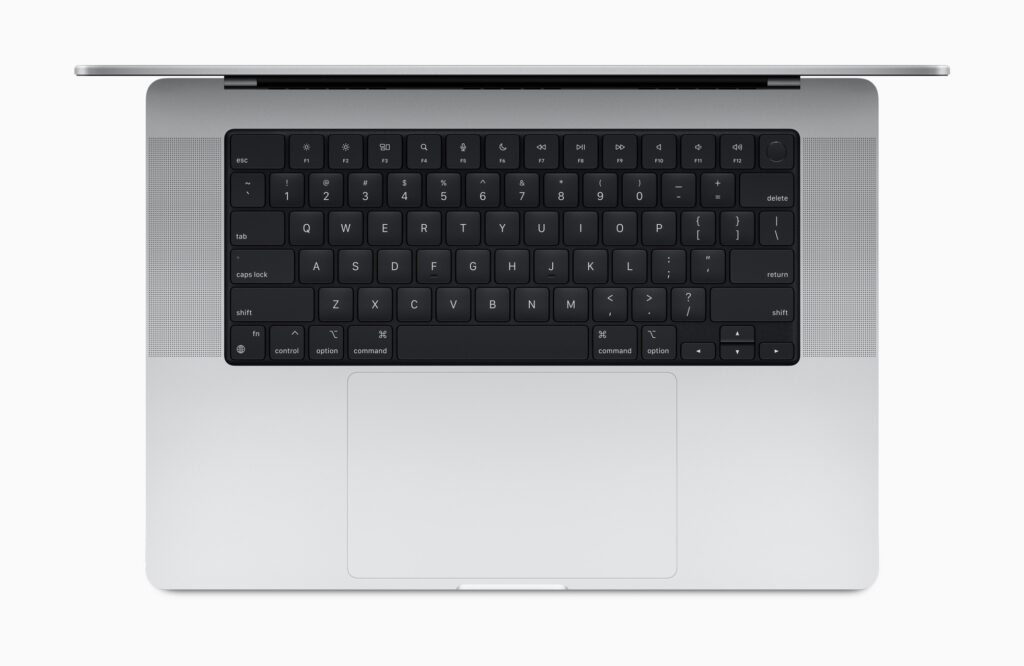
What’s missing? (Photo: Apple Inc)

The second of my resumed Houston Chronicle columns was posted today, and it’s a look at the Apple’s redesigned MacBook Pro line of notebooks. Sure, the beefed up versions of the already muscular M1 processor – the M1 Pro and M1 Max (what, no Pro Max??) – are the stars of the show, but for me the rollback of the minimalist 2016 MacBook Pro design is just as important.

As I wrote, Apple restored key ports that it stripped out five years ago, including the HDMI port, memory card slot and MagSafe, the magnetic charging connection. In the column, veteran tech analyst Tim Bajarin recounts a meeting with Steve Jobs in the late 1990s that pertains to Apple’s decision in 2021.

I love the redesign – and promptly ordered a new one to replace my 2014 MacBook Pro – but there’s something that’s been removed that makes me just a tad sad. Gone is the thin touchscreen that had replaced physical function keys at the top of the keyboard. The Touch Bar changed depending on what app was being used. It was a pretty divisive feature, and I suspect most MacBook Pro users either hated it or never used it.

While the MBP I own didn’t have it, I found it really useful when I reviewed or worked with newer models. I particularly liked the way the Photos app worked with it, how easy it made adjusting screen brightness and volume levels.

I was hoping that the Touch Bar would still be offered as an option, but no. Apple has replaced it with full-height function keys, with should make keyboard purists very happy. But I had been hoping my next MacBook Pro would have a Touch Bar, and now those dreams are dashed.

Oh well, at least I’ll have a notch at the top of my screen. There’s always that.