The next big-screen iMac may be a Pro. As a 27-inch iMac owner, I’m fine with that.

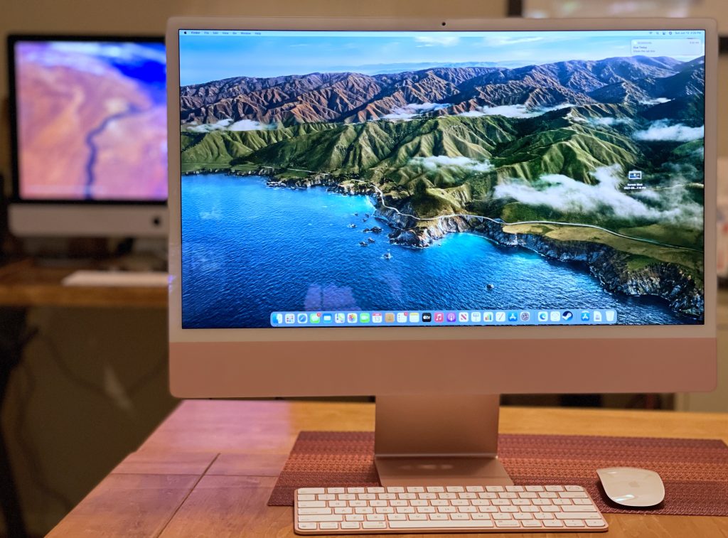
Apple’s 24-inch, M1-based iMac, with my beloved 27-inch, 2020 model in the background. Still no buyer’s remorse. (Dwight Silverman photo)

When my 2012 Mac mini fell off the compatibility list for Apple’s latest macOS update in 2020, I was confronted with a choice. I typically replace my Macs when they won’t get new updates, so it became time to say goodbye to this desktop workhorse. But at the same time, Apple announced at its Worldwide Developers Conference that year that the company would be moving to Macs built around its own processors, dubbed Apple Silicon.

While Intel-based Macs would continue to be sold, they were clearly the past, and Apple’s own chips were its future. The transition would take two years, and there was no guarantee which models would appear when. Still, I needed to make a decision now.

I wound up buying a 27-inch Intel iMac. Despite its transition away from Intel, Apple introduced an upgraded version of this design, which had been around forever. As I wrote in a review shortly after my purchase, it’s an incredibly powerful machine. I was happy . . . and still am.

But.

The introduction of the lower-end, smaller, 24-inch iMac with Apple’s own M1 processor last year showed the potential of this new platform. And it made me think . . . will I have buyer’s remorse once a larger-screen version of this iMac inevitably appears?

With the publishing today of Bloomberg Apple-beat reporter Mark Gurman’s latest Power On newsletter, I know the answer: No.

At least, not for a while.

Gurman, who’s got a good track record when it comes to Apple intelligence, lays out the company’s roadmap for updated Macs:

  • A new Mac mini with an M1 Pro chip
  • A 13-inch MacBook Pro with an M2 chip, to succeed the 2020 model and sit below the 14-inch and 16-inch MacBook Pro in the line
  • A Mac mini with an M2 chip
  • A 24-inch iMac with an M2 chip
  • A redesigned MacBook Air with an M2 chip
  • A larger iMac Pro with M1 Pro and M1 Max chip options [my emphasis]
  • A half-sized Mac Pro, the first with Apple Silicon, with the equivalent of either two or four M1 Max chips

If he’s correct – and with leaks, that’s always a big IF – then the next iMac with a larger screen is likely to be branded as an iMac Pro. The previous iMac Pro, which was discontinued last year, was incredibly powerful and incredibly expensive. In the subscriber-only version of his newsletter, Gurman also predicts that a lower-end, big-screen iMac is likely not coming soon.

That means the 27-inch iMac I purchased in 2020 is going to end as an even better buy. And I say that relatively, because this computer is not cheap. It starts at $1,800; the model I purchased was $2,400, not including Apple Care and taxes. I bet slapping the “Pro” label on the next version will add at least $1,000 to the price.

I would not be surprised if Apple continues to sell the 2020 27-inch iMac even after the release of a new iMac Pro, as it continued to sell the last Intel version of the MacBook Pro after the release of its first M1 laptops. The Intel model wasn’t laid to rest until the M1 Pro and Max versions were available.

Of course, all this remains speculative. It’s only rumor and vapor until it’s real. But for now, I remain comfortable with the choice I made.

A popularity contest

(Last updated 10:49 am CST February 8th, 2022)

Spider-man trying to give me more hair in the downtown Houston Chronicle newsroom, sometime in the early 1990s.

Who is the most popular fictional character of all time? And how do you measure that popularity?

Gene Park, who writes about video games and game culture for the Washington Post, said on Twitter that it’s “arguably” Spider-man. I replied, asking him what he based that on, and suggesting it maybe it’s James Bond, given the books and the longevity of that film franchise.

Now, neither of us had done any research, and I was just throwing Bond out there as an example. But I apparently stepped on a fanboy landmine in the Spidey metaverse, because I got attacked eight ways from Sunday for daring to suggest that Spider-man might not be the most popular fictional character ever.

My favorite insult: “…where do you come from, the 80s?” I replied: “Technically, I ‘come from’ the ’50s.” There was no response.

But this got me thinking: Who indeed is the most popular fictional character? How would you determine it? Sales of books, games and movie tickets? TV viewership? Or is it better to choose something more esoteric?

Atheists among us could point to religious figures – if you don’t think Jesus really existed, does that make him the most popular fictional character?

And, given the season, what about Santa Claus?

If you just use box office as the measure, standalone Spider-man films barely beat out Bond films (though the numbers I saw predate the 2021 Spidey and Bond movies), but that doesn’t include Marvel Cinematic Universe films in which he appears. The No. 1 box office character is Harry Potter, it turns out.

But that’s a fairly narrow measure. I think you have to determine the relevant measure before you come up with the answer to the question. So, I will ask you: Who do YOU think is the most popular fictional character of all time? And what’s the data that supports your answer?

(Originally posted on Facebook.)

Iconic Houston store Electronic Parts Outlet struggles in ‘survival mode’

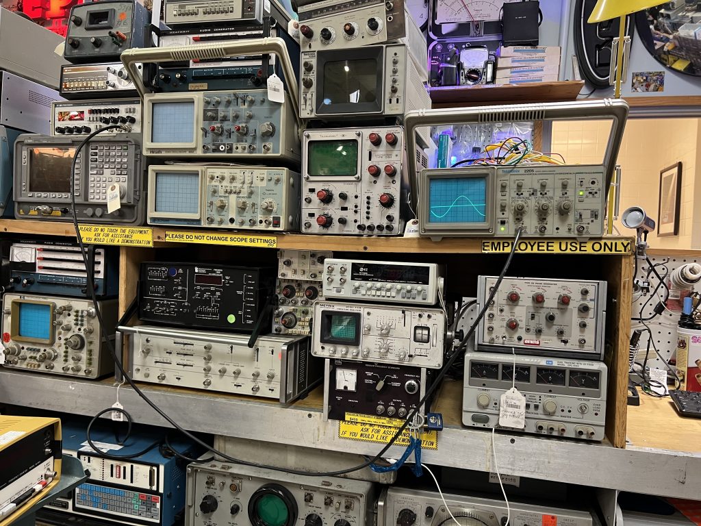
Oscilloscopes, anyone? (Dwight Silverman photo)

In Houston, the go-to place to snag hard-to-find electronic components has long been Electronic Parts Outlet. Founded in the mid-1980s, it’s legendary for its parts selection and for its inventory of vintage, even antique, tech. When I set out to do a story about it for the Houston Chronicle, I was amazed that no other media outlet had really covered it in depth.

And since I’ve been covering tech in Houston since the early 1990s, a big part of that is my fault.

I’m happy to correct that oversight with a story posted online today and scheduled to appear in Sunday’s business section.

As the story says, EPO is struggling. Hit with shifting consumer trends and natural disasters – Hurricane Harvey and the COVID-19 pandemic have dealt it body blows – foot traffic and sales are down. Co-owners Chris Macha and Rick Zamarripa are in, as Macha puts it, “survival mode.”

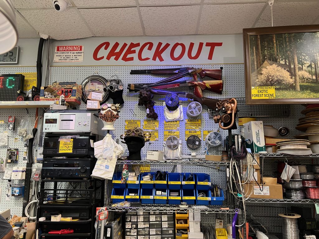
The view at the checkout lane. (Dwight Silverman photo)

The story I originally turned in was much longer than what was posted and will appear in print, as happens often. Here are some tidbits that got cut from the original:

  • Another store with the same name in Webster that co-existed for years with EPO was never affiliated with the store at Fondren and Lipan, which caused much confusion even among loyal and long-term customers. But Macha and Zamarripa did open a second store in the Willowbrook area that didn’t last long.
  • I spent a lot of time trying to track down and talk to the founders, Michele and Daniel Bretch, but was unsuccessful. They were last seen running the Industrial Country Market, a story with a similar aesthetic in Columbus. That store, however, was completely off-grid, generating its own electricity and collecting water from rains. It closed sometime around 2018.
  • The store has been helped out by customers who donate valuable, vintage tech to be sold. They come from estate sales and collectors who don’t ask for a cut – they just want EPO to survive.

Be sure and check out Chronicle photojournalist Karen Warren’s images in the story. She did a great job of capturing the store’s look and feel.

If you’ve not yet visited EPO, I’d urge you to do so. While Macha says he doesn’t want to close the store, he’s clearly in a fight for its survival. It’s a great place to find gifts for geeks, collectors and makers. Visit while you can.

Building a freelance infrastructure with Authory & Spark [Updated]

(Last updated 3:17 pm CDT October 14th, 2022)

Even though I’m kinda retired, I’m still doing some freelance writing. That’s what my resurrected Houston Chronicle column is, and I’ll also be writing occasional, standalone pieces for the paper. Since most of my writing has been for publications, I never spent much time building up an infrastructure for freelancing. Now, I’m fixing that, and I’ve come across a couple of products that help with that.

🎵 All of me, why not take all of me? 🎶

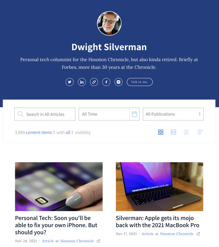
The first is Authory, a paid service that generates a portfolio by pulling your content from all the places it lives on the web and organizing it in an attractive, useful archive. You can then provide a publication you’re pitching a comprehensive look at your body of work.

While I’ve spent most of my full-time-employee status at the Chronicle, the paper’s online presence has multiple URLs. My stuff is the subscription-based HoustonChronicle.com, of course, but some of it also found at the free Chron.com. The latter has many of my older columns and tech stories, published before the paid site was launched. And there’s also my old TechBlog, which has its own unique URL. On top of that, I’ve written at Forbes, a little bit at Medium, and of course here on The Workaround.

Authory lets you enter the URLs where you byline is found and, within 48 hours, creates a profile page with a smartly designed, responsive look. Readers can see the list based on a text search, dates or publication.

There are other features that I have yet to dig into, including the ability to write on the Authory site; tracking your content’s social media performance; limiting who can see what items; build collections based on keywords or manual curation; and generate RSS feeds. People can also subscribe to a mailing list that alerts them when you have a new item in your profile.

There are no ads on the site, and all your content is available to anyone (unless you restrict it in some way), but it won’t get people past a site’s paywall. That said, when an Authory user clicks on an item on their own profile page, it comes up in a clean, ad-free reader view – which is part of a content backup Authory creates for you.

There’s a two-week free trial, which can be extended to four weeks if you tweet about Authory on Twitter. After that, it’s $10 a month or $8 a month if you pay for a year in advance. (If you review it, you’ll get a free year. I am not writing this for that purpose, and won’t accept a free year. It’s worth paying for!)


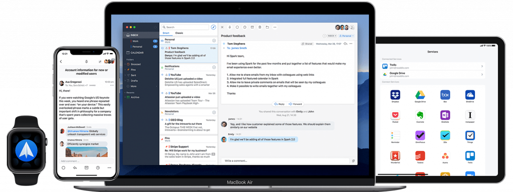
Spark is everywhere: iOS, Android, macOS … and soon, Windows.

When I was at the Chronicle as a staffer and at Forbes, I used Outlook for work email both on my Windows desktop at the office and my Macs at home and on the road. When I was no longer an employee, I lost access to the Outlook and was at the mercy of the Mail app on macOS. I’ve never cared for it, and relying on it day-to-day didn’t change my feelings.

An issue with a recurring password popup drove me to seek an alternative, and I found an excellent one in Spark, a free email app from Readdle, which makes productivity software. I’d tried Spark when it first launched and wasn’t that impressed, but it has greatly improved since.

Spark falls into the simple-but-powerful category. It’s fast, intuitive and can handle almost any email format, including Microsoft Exchange (which I don’t need at the moment, but it’s good to know it’s there). Besides Exchange, it also supports Gmail, Outlook.com, Office 365, iCloud, Yahoo, Kerio and IMAP email servers.

The app is available for macOS, iOS and Android, and a Windows version is in the works. Its cross-platform nature is an added bonus because it’s remarkably easy to set up the software on a new device, particularly if you have a boatload of inboxes, as I do. Once you have all your accounts established in Spark on one device, all you need to do after installing the app on another is to log in to your primary account, and all the others are automagically added. Sweet!

As do most modern email clients, Spark uses AI to emphasize important emails over those that are less critical. But if you want to see your inbox in pure chronological order, you can turn that off (which I do). Unfortunately, the default workflow is a unified inbox, and while you can’t turn it off completely, you can display all your inboxes in the the left sidebar of the app. With nine email accounts, I’d rather they not all be merged into one.

Spark’s layout looks a lot like Outlook and the Mac’s Mail app, but leaner. The left sidebar has your mal accounts and folders; the middle are the headers and summaries of your mail; and the right pane is a full-sized reader.

As do a lot of email clients, you can create templates for canned responses, schedule email and “snooze” emails you want to get back to later. You can also set reminders to reply to mail that you can’t get to right away. And if a communique doesn’t really require a full response, there are social-media-like responses and emojis you can employ.

Spark integrates with calendars and a slew of online services, including Zoom, Microsoft OneNote, Evernote, Trello, GoToMeeting and more.

Spark also has some collaboration features and the ability to create Teams to work jointly with email, but the number of participants is limited on the free version. You get more capabilities and more shared users for $7.99 a month or $6.99 a month billed yearly. But for most individual users, the free version is an excellent alternative to Outlook or the Mail app.

Update 11.29.21: In a conversation on Twitter this morning, the offical @SparkMailApp account let me know that the Windows version will actually be “a brand new desktop app” for both Windows and Mac.

Confessions of a MacBook Pro Touch Bar fan

What’s missing? (Photo: Apple Inc)

The second of my resumed Houston Chronicle columns was posted today, and it’s a look at the Apple’s redesigned MacBook Pro line of notebooks. Sure, the beefed up versions of the already muscular M1 processor – the M1 Pro and M1 Max (what, no Pro Max??) – are the stars of the show, but for me the rollback of the minimalist 2016 MacBook Pro design is just as important.

As I wrote, Apple restored key ports that it stripped out five years ago, including the HDMI port, memory card slot and MagSafe, the magnetic charging connection. In the column, veteran tech analyst Tim Bajarin recounts a meeting with Steve Jobs in the late 1990s that pertains to Apple’s decision in 2021.

I love the redesign – and promptly ordered a new one to replace my 2014 MacBook Pro – but there’s something that’s been removed that makes me just a tad sad. Gone is the thin touchscreen that had replaced physical function keys at the top of the keyboard. The Touch Bar changed depending on what app was being used. It was a pretty divisive feature, and I suspect most MacBook Pro users either hated it or never used it.

While the MBP I own didn’t have it, I found it really useful when I reviewed or worked with newer models. I particularly liked the way the Photos app worked with it, how easy it made adjusting screen brightness and volume levels.

I was hoping that the Touch Bar would still be offered as an option, but no. Apple has replaced it with full-height function keys, with should make keyboard purists very happy. But I had been hoping my next MacBook Pro would have a Touch Bar, and now those dreams are dashed.

Oh well, at least I’ll have a notch at the top of my screen. There’s always that.